Sunday 29 December 2013

Commercial Modernism

Herbert Matter

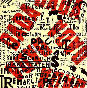
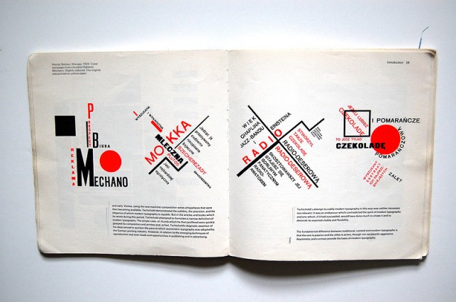
    Herbert Matter was Swiss graphic designer and photographer. His techniques in photography and graphic design became so innovative and important in 1930's, and then evolved into familiar design idioms such as overprinting- the design where an image extends over the frame- the bold use of colors, sizes, and placement in typography. These techniques, except characterize him, characterize pre-war European Modernism and the post-war expression of that movement in the United States as well.


    He was very interested in work of sculptor Alberto Giacometti. That latter, led to a compelling body of photographic work. They once met in 1960 and Harbert Matter began photographic the sculptor's work leading to a twenty-year project that reminded a personal and profound artistic endeavor for him.
    His archive contains the largest collection of visual material by a single artist. It contains a thousands of fine art, commercial prints, design process materials such as sketches, paste-up layout work, collages, exhibition materials, photographs, negatives including glass plates.


     His creative scope of graphic design was boundless. Journalistic, imaginative and manipulative photography were revolutionary influences. Matter started to experiment with camera, as with strong design tool and expressive form-a relationship that never ended. Matter was inspired by the work of El Lissitzky and Man Ray especially by photograpms, and the magic of collage and montage. His official entrance as a graphic designer was when he was hired  as a designer and photographer for the legendary Deberny and Peignot concern. He learned there the fine typography.
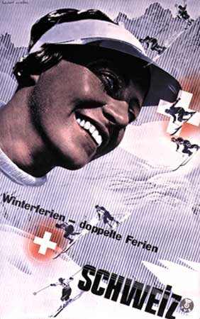
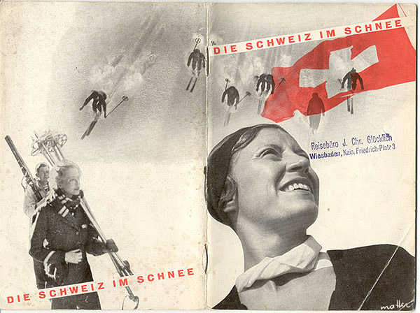
      Later on, his returning to Switzerland was main for his future. He was surrounded by a god graphic and that is how he learn the best, said Paul Rand. He designed posters for the Swiss Tourist Office. 
Eisenman said about him: '' He was good at everything he tried to do.'' In 1954 he was commissioned to create the corporate identity for the New Haver Railroad. The omnipresent ''NH'' logo, with its elongated serifs, was one of the most famous symbols in America.


References:
Herbert Matter: Modernist Photography and Graphic Design | Stanford University Libraries. 2013. Herbert Matter: Modernist Photography and Graphic Design | Stanford University Libraries. [ONLINE] Available at:https://library.stanford.edu/spc/exhibitspublications/past-exhibits/herbert-matter-modernist-photography-and-graphic-design. [Accessed 29 December 2013].

The Visual Language Of Herbert Matter | a documentary film by Reto Caduff . 2013. The Visual Language Of Herbert Matter | a documentary film by Reto Caduff . [ONLINE] Available at: http://www.herbertmatter.net/matter.html. [Accessed 29 December 2013].

Monday 25 November 2013

International typography style

After the second world war came the Swiss Grid Style, also known as international typography style. It was developed by Swiss designers, such as Arming Hormann, Joseg Muller Brockmann, Max Bill, Richard P Lohse, Hand Neuberg and Carlo Vivarelli. They started to experimented with photomontage as well.

Their work was characterised as cold, emotionally sterile grid style.They used structured layout, unjustified type that became very influential. They saw graphic design as part of industrial production so they was searching for something anonymous. Illustrations were no used almost at all, they prefer using photographic images.
The characteristic of International Typographic style were:

* Asymmetrical organizing the design elements on constructed grid
* Using photography and illustration to present visual and textual information
* Using sans-serif typography set. They believed it expressed the spirit of a progressive age.

They believed that visual appearance of the work is not the most important thing. Design should be grounded on universal artistic principles and designer for them is not artist, he is communicator with his visual works. The ideal of design is to achieve clarity and order.


Max Bill

He was Swiss graphic designer, architect, sculptor and painter. He was mostly doing the advertising designs. Forced to study at Bauhaus, he learned about architecture, with metalwork, stage design and painting. He was really all over the place so latter he was focusing on doing painting, architecture and sculpture while he was living by earning money for designing advertisements.
Bill was convinced that architecture and design could create a new society if only informed by science and shaped by technology. He derived his rigorously geometric forms and meticulously planned and fashioned compositions from mathematical systems, formulae and other relationships, while his use of colour is reminiscent of charts illustrating theories of colour and its perception.


References
Max Bill (Swiss artist) -- Encyclopedia Britannica. 2013. Max Bill (Swiss artist) -- Encyclopedia Britannica. [ONLINE] Available at:http://www.britannica.com/EBchecked/topic/65351/Max-Bill. [Accessed 25 November 2013].

A History of Graphic Design: Chapter 42; The Swiss Grid System -- and the Dutch Total Grid. 2013. A History of Graphic Design: Chapter 42; The Swiss Grid System -- and the Dutch Total Grid. [ONLINE] Available at: http://guity-novin.blogspot.com/2011/07/chapter-42-swiss-grade-style-and-dutch.html. [Accessed 25 November 2013].

Jan Tschichold

Jan Tschichold was an typographic advisor and designer. He defined the new typography.
For his 70th birthday he wrote his own tribute in the third person. It began: ''Two men stand out as the most powerful influences on 20th century typography: Stanley Morison, who died in 1967, and Jan Tschichold.''


   Jan was naturally put in the print industry because of the family from which he came but he was very curious about new ''isms'' in art. He latter came away from the Bauhaus exhibition and soon after that he was chief propagandist for the new movement in typography, crossing Europe. He was trying to connect the new typography to the ''total complex of contemporary life''. The book set some things in stone: the use of sans-serif fonts, asymmetrical rather than centred layouts. He used geometrical elements and diagonal arrangements in every single thing. Basicly it was two-colours toned with small half-tone photographs, never rectangular, but cut-out as circles or silhouettes.


But not everyone was impressed with the new thing Tschichold brought. The Nazi were very suspecious of modernism, they taught of that as ''un-German''. After he realised his book he was called as ''cultural Boshevists''. And after ten days they put him in prison. 
   But after all that Penguin transformed his book as ''good book cheap'' and sold it in three million copies. His examinations of book proportions are critical histories of lettering and typefaces, and the elegance of his book design, are on the shelves in advertising agencies and design studios. And at this site is explained how each letter should look for him: http://www.tschichold.de/.


References:
 Richard Hollis: the brilliance of typographer Jan Tschichold | Art and design | theguardian.com . 2013. Richard Hollis: the brilliance of typographer Jan Tschichold | Art and design | theguardian.com . [ONLINE] Available at:http://www.theguardian.com/artanddesign/2008/dec/05/jan-tschichold-typography. [Accessed 25 November 2013].

Bauhaus- The Face of the 20th century

Bauhaus is the base of design process and education and still influence a lot of our decisions and style.
The Bauhaus school was founded  by Walter Gropious in Weimar. It was started with the idea of creating a ''total'' work of art in which all arts, including architecture, which will eventually come all together. The Bauhaus had a major influence in art, architecture, graphic design, interior design and typography. It involves everything that we are still doing today. Even the way we are thinking. The simplicity and attention to details, balance between form and function etc.


In the school they were trying to combine fine arts and arts and crafts, so that has a major influence of graphic design. They favored simplified forms, rationality, functionality and the idea that mass production could live in harmony with the artistic spirit of individuality. The teachers were, besides Gropius, Lazlo Moholy- Nagy and Herber Bayer. They taught, besides art, typography as part of it.


Lazlo Moholy- Nagy

The expectations of the age of technology and his new media let Moholy- Nagy to a functional use of Abstraction, which he managed to show in al areas of design and which guided him through different phases of experimenting. He and Gropius were working as a stage designer, exhibition organiser, typographer and film producer. He was experimenting with a lot of things such as painting, film, photography, design and with photograms.


Wassily Kandinsky

In Kandinsky's works of his childhood period can be found specific colour combinations, which he explained by the fact that ''each colour lives by its mysterious life''. In the future he started o stage of intensive fruitful search. It was basicly landscapes, based on colour discords. In his creativity and organizational skills he always attracted anything intellectual, restless, striving, which was in the world of art of the time.
He was the first person to be credited with creating modern abstract woks. He used to call his art as ' inner beauty, fervour of spirit, and deep spiritual desire, inner necessity'. In every of his works he never put human beings, everything was in character of abstract figures.

References:
Bauhaus Influence | Abduzeedo Design Inspiration. 2013. Bauhaus Influence | Abduzeedo Design Inspiration. [ONLINE] Available at:http://abduzeedo.com/bauhaus-influence. [Accessed 25 November 2013].

The Bauhaus : Design Is History. 2013. The Bauhaus : Design Is History. [ONLINE] Available at: http://www.designishistory.com/1920/the-bauhaus. [Accessed 25 November 2013].

Lazlo Moholy-Nagy Biography - Infos - Art Market. 2013. Lazlo Moholy-Nagy Biography - Infos - Art Market. [ONLINE] Available at: http://www.moholy-nagy.eu/. [Accessed 25 November 2013].

Wassily Kandinsky - biography, paintings, books. 2013. Wassily Kandinsky - biography, paintings, books. [ONLINE] Available at:http://www.wassilykandinsky.net/. [Accessed 25 November 2013].

Modernism

Huge influence which is continuing till today has The Modernist school. The modernism started at the end of the 19th century and continue to the 20th century. Because of the earlier using of machines instead of humans for working goods, this movement put the artists to thing their practice. One of the main rules of this time was 'Function should always dictate form'.


   In this movement belong impressionism, cubism, fauvism, futurism, brutalism and surrealism. With all of that, and with all the innovative things that artists did at that time this became the most influential movement of the 20th century. It changed thinking process for communications, graphic design and typography. Before this happened design of everything was overdecorated, they were trying to over fill every poster with imaginary and type. But, at this movement they changed that. Their motive were to structure grid system with emphasis on negative space, just using clean San-serif type. They wanted to create strong graphics that were against commercialism, greed and cheapness.


De Stijl

This movement was led by group of architect in which was Theo van Deosburg. Their style was to put blocks with black and whites, without any curves. Strict and simple.


The harmony and order was established through that reduction and with only use of primary colours. The publication De Stijl represents the most brilliant designs of that movement.

Piet Mondrian, Composition with Yellow, Blue and Red, 1937


Theo Van Doesburg
At first Theo Van Doesburg was a competent figurative painter, his work reminiscent of Van Gogh in early ages. Later he met Mondrian and than begins the creation of De Stijl movement. His life was short but full of important things that he did. He was electic, element in a diverse and chaotic artistic world. The main things of his works were ideal houses, created in conjunction with the young architect Cornelis van Eesteren. Besides of his involvement in De Stijl movement his appearance is of the importance in the Dada.


References:
The easy guide to design movements: Modernism | Graphic design | Creative Bloq. 2013. The easy guide to design movements: Modernism | Graphic design | Creative Bloq. [ONLINE] Available at:http://www.creativebloq.com/graphic-design/easy-guide-design-movements-modernism-10134971. [Accessed 25 November 2013].

De Stijl : Design Is History. 2013. De Stijl : Design Is History. [ONLINE] Available at: http://www.designishistory.com/1920/de-stijl/. [Accessed 25 November 2013].

 Theo van Doesburg: Forgotten artist of the avant garde | Art and design | The Guardian . 2013. Theo van Doesburg: Forgotten artist of the avant garde | Art and design | The Guardian . [ONLINE] Available at:http://www.theguardian.com/artanddesign/2010/jan/23/theo-van-doesburg-avant-garde-tate. [Accessed 25 November 2013].

Cubism


           Design concept of cubism was independent from the nature, it began using tradition as a way of seeing and a pictorial art. The roots of this movement are in works of Spanish painter Pablo Picasso and his applied elements of the ancient Iberian and African trivial art to the human figure. He disassembled a human figure into a series of flat transparent geometric plates that overlap and intersect at various angles.
         The ideas of cubists' were to put to the subject emotions not to be natural. They wanted to change complied elements for aesthetic reasons rather than reality.
Fernand Leger , pages from 'La fin du monde'
          Perceptions like that planes are of the involved artistic subject matter, they were analysed from different points of view and they are used to construct a piece of art composed of rhythmic planes. The subject matter of this stage was shape, colour, texture, and values used in spatial relationships.
   Fernand Leger was the artist who moved cubism away from that founders work. His works was potentially heading towards evolving onto an art form of pure colour and shape relationships but this time in visual perception. His pictographic simplifications of human figure and objects were the biggest inspiration for modernist pictorial graphics. Later they inspired French poster art.
Fernand Leger, The city 1919
    By this new approach and different things they tried at this movement, they changed and inspired a lot painters and graphic designers. It pushed art and design into geometric abstraction.

References:
Having a look at History of Graphic Design: Cubism. 2013. Having a look at History of Graphic Design: Cubism. [ONLINE] Available at:http://havingalookathistoryofgraphicdesign.blogspot.com/2012/11/cubism_7.html. [Accessed 25 November 2013].

Analytical Cubism. 2013. Analytical Cubism. [ONLINE] Available at:http://www.historygraphicdesign.com/index.php/the-modernist-era/the-influence-of-modern-art/192-analytical-cubism. [Accessed 25 November 2013].

Dada

      Dada was the movement which came after WWI so because of that artists of that time were against the carnage of WWI. They claimed to be anti-art and had a strong negative and destructive element in they designs. Writers were concerned with shock, protest and nonsense. It is reasonable for everything to be like that because the happenings in that period. They just wanted to do everything against that horrors of war. They also wanted to show the people why they were wrong for believing in machines. In one word they were rejecting all the tradition.


     The most prominent visual artist of this movement were the French painter Marcel Duchamp. The philosophy of freedom allowed him to create ready-made sculpture, such as bicycle wheel mounted on a wooden stool, to exhibit random object such as urinal as a piece of art. Duchamp was the artist who draw a moustache on a reproduction of Mona Lisa which was not well accepted by people.


       The most different things that Dadaists did was innovative approach to typography, photo-montage, negative white space, layout, letter spacing and line spacing. This things played the main role in development of communication design. Everything in Dada movement has rebellious structure. That adopted only futurists art of typography.


References:
A History of Graphic Design: Chapter 45; Dadaism; The meeting point of all contradictions. 2013. A History of Graphic Design: Chapter 45; Dadaism; The meeting point of all contradictions. [ONLINE] Available at: http://guity-novin.blogspot.com/2011/08/chapter-44-dadaism-meeting-point-of-all.html. [Accessed 25 November 2013].

Sunday 24 November 2013

Futurism

Futurism began when the Italian poet Filippo Marinetti published his Manifesto of Futurism in the Paris newspaper Le Figaro 1909. He established futurism as a revolutionary movement. Artist in this movement were fighting against the reallity of scientific and industrial society.. Later in 1913 Marinetti published article against the classical tradition and in which he was calling for a typographic revolution.


Most of the graphic designers of that time used vigorous horizontal and vertical structure. They did not want any more to be traditional so they put in their designs dynamic, non-linear composition achieved by pasting words and letters in place for reproduction from photo-graved printing plates. Lewis Carrol's Alice's Adventures used very innovative and different way of presenting text in the page. It was constructed mouse's tail from the letters.

One of the artist who wanted to live by the terms of futurist philosophy is Fortunato Depero (1892-1960). He produced a lot of thing such as dynamic posters, a lot of experimentinf with typography and advertising design. He worked for the magazines such as Vanity Fair, Movie Markers and Sparks. His techniques were adopted by Dadaists, constructivists and De Stijl.
References:
Inkling for Web. 2013. Inkling for Web. [ONLINE] Available at:https://www.inkling.com/read/history-of-graphic-design-philip-meggs-5th/chapter-13/futurism. [Accessed 24 November 2013].

Art Deco

Design of glamour
 The term 'art deco' arrived from the 'Exposition Internationale des Arts Decoratifs et Industrial Moderns' which was held in Paris in 1925. It is an artistic and design style which had his origins in Paris. It was led by the best designers in the decorative arts such as fashion and interior design. It ran through all of the areas of the designs. From architecture, industrial design, visual arts etc. It was very glamourous and elegant style of that time. Very modern in innovative. Like nothing else before.
From Art Nouveau, Art Deco slightly started to change and remove thing that had been used. They moved away from the pastel colours and organic forms, they was getting influences from different things. One of that thigs were movements of the early 20th century, including Constructivism, Cubism, Modernism, Neoclassical and Futurism. 
Typical atributes were geometric shapes, bold curves, strong vertical lines, aerodynamic forms, motion lines, airbrushing and sunburst glore. They always need a great context to start with.

Madda 'New York' poster


Art Deco posters

 CASSANDRE (1901-1968)
'Dubonnet', 1932
French designer from Art Deco movement who was one of the famous ones were Adolphe Jean-Marie Mouron Cassandre. He was one of the gratest poster designers of the 20th century. His posters were something that was very rare and innovative at that time. He was celebrating the new models of luxury transport that characterise the prosperous lifestyle. He often used stencils and airbrush technique to show speed of the trains.


Steve Forney Art Prints and Posters
London-Paris Overnight Express Art Print


Alexey Brodovich (1898-1971)

He was Russian photographer and designer who later became the art editor of Harper's Bazaar. His works for that magazine were extraordinary. One of the most influential designer in the field of the graphic design 20th century.
Brodovich worked in many fields such as, designing fabric, jewellery, restaurant décor, poster, department stores' advertisements. Combining text and photography with copious amount of space was the main idea in his work. Nothing like before. But he did not want to give the formula and pattern to his work to be good; he said :'' There is no recipe for good layout. What must be maintained is a feeling of change and contrast. A layout man should be simple with good photographs. He should perform acrobatics when the pictures are bad.''


Referencing:
Art Deco: a strong, striking style for graphic design - Designer Blog. 2013. Art Deco: a strong, striking style for graphic design - Designer Blog. [ONLINE] Available at: http://99designs.com/designer-blog/2012/06/05/art-deco-a-strong-striking-style-for-graphic-design/. [Accessed 24 November 2013].


The History of Visual Communication - The Modernists. 2013. The History of Visual Communication - The Modernists. [ONLINE] Available at:http://www.citrinitas.com/history_of_viscom/modernists.html. [Accessed 24 November 2013].