Tuesday 28 January 2014
Monday 27 January 2014
Stefan Sagmeister
Stefan Sagmeister is a very different designer by his approach to it. His designs are timeless, he created a lot of eye-catching graphics for clients including the Rolling Stones and Lou Reed, and he pours his heart and soul into every piece of work he produced. He pays attention on the smallest details, which offers you always a new way to look at it. Although his designs contains a bit of humor, he is very serious designer. His intimate approach and sincere thoughtfulness elevate his design. He created a poster advertising a speaking engagement by carving the salient details onto his torso.
"Sagmeister's CD package designs are what poetry is to prose: distilled, intense, cunning, evocative and utterly complete. His intentions have set a new standard" - I.D. Magazine
"Sagmeister's CD package designs are what poetry is to prose: distilled, intense, cunning, evocative and utterly complete. His intentions have set a new standard" - I.D. Magazine
This video is better represents his approach, his designs, his view to life, and how different he is, how he appreciate happiness, and how he wants to bring happiness to his own, and other people's lives.
His provocative designs tweak the status quo and question the designer's role in society. He is very well known by his tricks of senses through design, typography, environmental art, upsetting norms etc. He has worked for the Talking Heads, The Guggenheim Museum, Levis, the Rolling Stones and Lou Reed.
His motto is ''Design that needed guts from the creator and still carries the ghost of these guts in the final execution" He takes a year-long king of inspirational-vacation, every seven years, and during that period he is not doing work for the clients. He spends a year experimenting with personal work and refreshing himself as a designer.
References:
Stefan Sagmeister | Designers & Books. 2014. Stefan Sagmeister | Designers & Books. [ONLINE] Available at:http://www.designersandbooks.com/designer/bio/stefan-sagmeister. [Accessed 27 January 2014].
AIGA | Stefan Sagmeister . 2014. AIGA | Stefan Sagmeister . [ONLINE] Available at: http://www.aiga.org/medalist-stefan-sagmeister/. [Accessed 27 January 2014].
Stefan Sagmeister | Profile on TED.com. 2014. Stefan Sagmeister | Profile on TED.com. [ONLINE] Available at:http://www.ted.com/speakers/stefan_sagmeister.html. [Accessed 27 January 2014].
Art Chantry
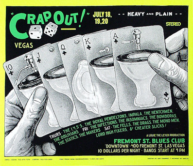
Art Chantry, director of the Rocket newspapers which documented Seattle's music scene in the 90s. He created many groundbreaking posters and album covers for bands from the Pacific Northwest, including Nirvana, Gang of Four, Hole and The Sonics. He has been making posters since he was fifteen. His major influences were a lot of forms of "outsider art", such as monster magazines, hot-rod art, and psychedelic culture as well. Posters which he created at that time were very innovative, he found his inspiration for that innovation in article on Polish posters.
He made his posters of American Vernacular, Throwaway visual language, old newspaper ads, catalogue parts. He liked to use what looked like a cheap ad but with the new technological sharpness of photography & print. He finds himself in the Seattle at the punk scene, which originally his design had relation with, just creating posters for local rock concerts. His king of design, known as by his low-tech and high contrast approach influenced generations of poster artists. His work has been exhibited at the Rock and Roll Hall of Fame Museum of Modern Art, Seattle Art Museum, the Smithsonian and the Louvre.
References:
Search Artists / American Art. 2014. Search Artists / American Art. [ONLINE] Available at: http://americanart.si.edu/search/artist_bio.cfm?ID=7244. [Accessed 27 January 2014].
Art Chantry | Biography, Life, Work, Logos and Awards . 2014. Art Chantry | Biography, Life, Work, Logos and Awards . [ONLINE] Available at:http://www.famouslogos.net/art-chantry/. [Accessed 27 January 2014].
David Carson
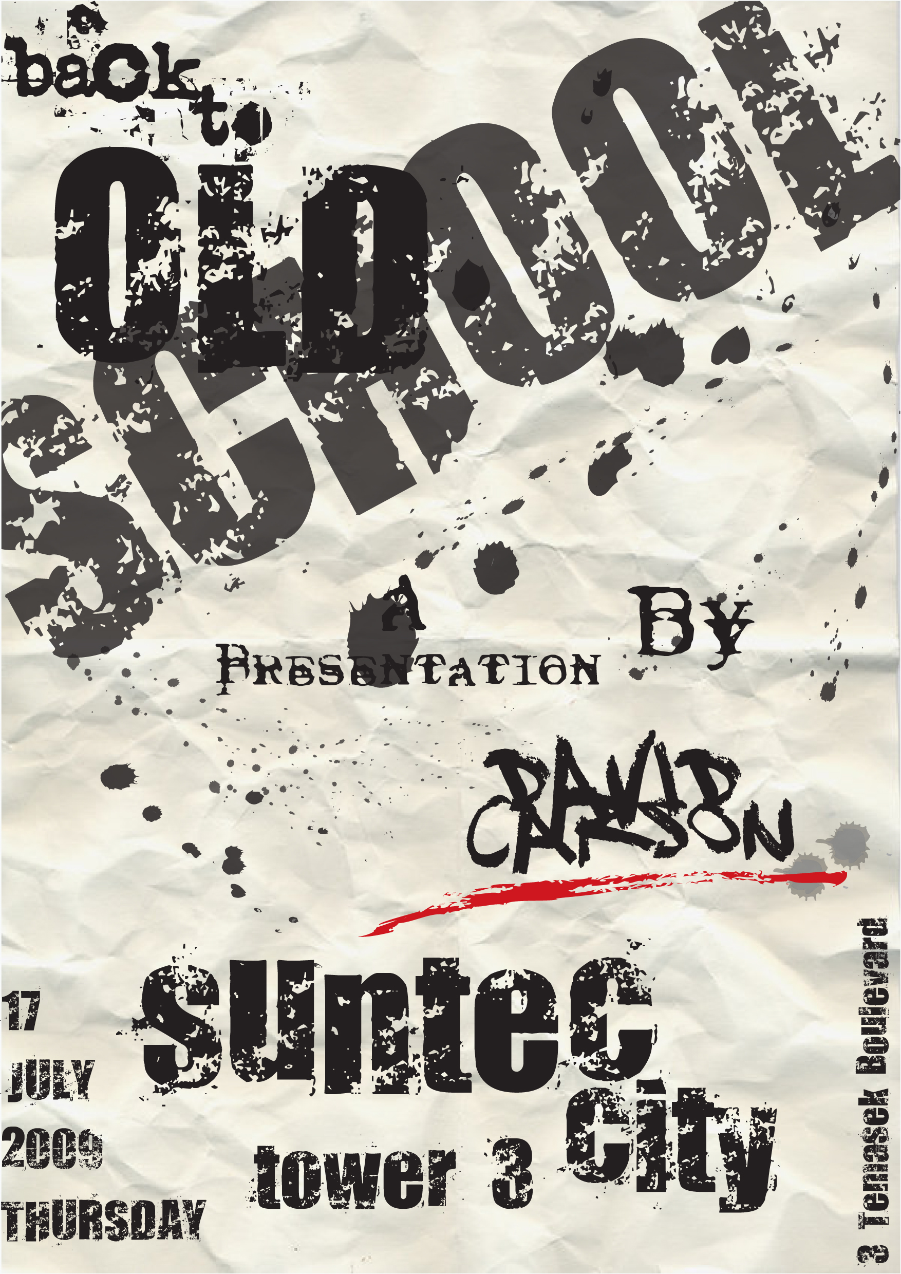
David Carson is the acclaimed graphic designer who created Ray Gun magazine, and he is so-called Godfather of the Grunge. His rule was simple: you don't have to know the rules before breaking them, and never mistake legibility for communication. His techniques were ripping, shredding and remaking letters which touched a nerve.
His early work as a graphic designer was not appreciated that much in his own time. He has critiques about his typography for not being serious, and that he was destroying the origins and foundation of communication design. Furthermore, today his work is well known to everybody and dominates design, advertising, the Web, and even motion pictures.
His early work as a graphic designer was not appreciated that much in his own time. He has critiques about his typography for not being serious, and that he was destroying the origins and foundation of communication design. Furthermore, today his work is well known to everybody and dominates design, advertising, the Web, and even motion pictures.
He was well known by his projects for a music magazine called 'Ray Gun', and his first book, 'The End of Print: The Graphic Design of David Carson'. His early designer career started with the commercial design class that he enrolled in, instructed by a Swiss designer called Hans-Rudolph Lutz. His work was so unique because in them he has overlapping photos and diversity of typefaces. He did not follow the basis of communication design. The arrangement in his text was not that we can normally see, he was making them ir order positioned in dissaray creating chaos and confusion which was very innovative at the time. Some of the images in his designs were deliberately obscuring the text that goes with it and creating an unfinished sentence or word. His rule was ''Less is more''.
He made designs for numerous corporate companies under the name of David Carson Design, such as Microsoft, Toyota, Giorgio Armani, Quicksilver, Nike, Levi's and many others. His book was best selling graphic design book of all times. He was famous by his humorous quotations on design:
- " There is no other time in the year where commercials can take center stage. Commercials are always the things that are playing when you are going to the bathroom or grabbing a soda from the fridge."
- The criminal, like the artist, is a social explorer."
- Graphic design will save the world right after rock and roll does."
- A lot of commercials that have been rejected are really entertaining."
References:
david carson design. 2014. david carson design. [ONLINE] Available at:http://www.davidcarsondesign.com/?dcdc=top/s. [Accessed 27 January 2014].
An Interview with David Carson « Layers Magazine. 2014. An Interview with David Carson « Layers Magazine. [ONLINE] Available at:http://layersmagazine.com/an-interview-with-david-carson.html. [Accessed 27 January 2014].
David Carson by Irem Dogruer | Culture of Design - Global Design in the 21st Century. 2014. David Carson by Irem Dogruer | Culture of Design - Global Design in the 21st Century. [ONLINE] Available at:http://cultureofdesign.wordpress.com/2010/05/02/david-carson-by-irem-dogruer/. [Accessed 27 January 2014].
Monday 20 January 2014
Chart
In my chart i presented five female, very interesting designers. Cipe Pineles- The New York School, Hannah Hoch- Dada, Muriel Cooper- Corporate Identity, April Greinman- Postmodernism, Zuzana Licko- Digital. Although they are from different movement and their style is very different, in his work i saw a lot of similarity, and the possibility of affecting each other. For me their work is amazing and very inspirational. I like how they were doing designs in time where there were not that much women as a graphic designers.
- My main idea is to create flower looking template because they are ladies,and they deserve something special and girly but still appropriate.
- Than i put around their heads all theirs work, matching the colours and conrasting with the background.
- At the next step i created small circles connecting each of them, representing their similarities, their styles, ways of creating designs and things in common which can be influential on the others.
Saturday 18 January 2014
Grunge
Grunge emerged in Seattle in the 80's and 90's. The grunge was appeared in music first and popularized by alternative rock bands such as Nirvana. From music it spreads to fashion and graphic design. It was inspired by Punk/Heavy Metal/Indie Rock. The fashion of this style included acid-washed pants, long hair on both sexes, and the usual leather jacked with the randomly places band names. A lot of things comes from punk to this style, with their anarchist behavior, rebellion to the clothing.
Things were messy then, from the skateboard to graffiti and toe rings and VHS tapes. So the design was messy too. Words were splayed and chaotic, letters blurred. Textures thick and heavy.Concert posters looked like someone had splattered paint on paper and then scratched out band names. The typography of that time is called grunge and later it became the largest, most cohesive movement in recent font design history. First you could see it everywhere, but that it wasn't anymore.
Like the many other things of the 90's, grunge typography was rooted in angst and discontent. It came in backlash, the same like the punk came in. Aesthetic fueled by a raw emotion. The grunge popularity was coincided with Macintosh. The designers had an opportunity to change the hand drawing and working by computer work. It was some kind of liberation for him. All of the designers rejected the rule-based fonts of their forebears. It had never seen before.
References:
The Rise And Fall Of Grunge Typography - The Awl. 2014. The Rise And Fall Of Grunge Typography - The Awl. [ONLINE] Available at:http://www.theawl.com/2012/08/grunge-typography. [Accessed 18 January 2014].
Deborah Sussman
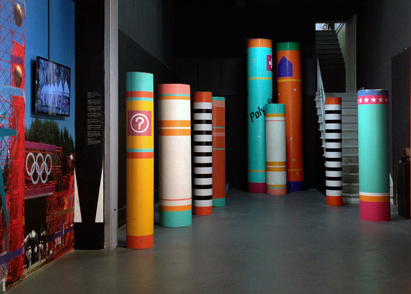
Deborah Sussman is very well known as a pioneer in environmental graphic design, specializing in urban branding. She creates arresting visual images and designed its highly imaginative applications for architectural and public spaces.
Her work has a lot of impact on Los Angeles. Some says that Los Angeles would not look like how it it now without her designs. When they think of Los Angeles of the 70s and 80s, they come up with Sussman's collage they picture in their mind's eye. Her marks were: bold, color, color, color. The city's postmodern verve is directly indebted to her influence, as a forthcoming show aims to illustrate.
The vibrancy of color that she discovered there has always stayed with her,especially the bright yellow and magenta icing on the sugar skulls and sweet breads. She says that is pretty amazing for her. SHe did not like to have boundaries, for her to have one language, one color and one typeface is lack of freedom. She also says about her work that it is ''exuberant and bold''.
Her work has a lot of impact on Los Angeles. Some says that Los Angeles would not look like how it it now without her designs. When they think of Los Angeles of the 70s and 80s, they come up with Sussman's collage they picture in their mind's eye. Her marks were: bold, color, color, color. The city's postmodern verve is directly indebted to her influence, as a forthcoming show aims to illustrate.
She said that her influences are Ray and Charles along with Alexander Gerard who was working with her, and each of them was great mentors to her. The thing that shaped her is her trip to Mexico. She went there in the early 1950's to take photos as part of a research for 'the day of the dead' film and was really taken back by the place, people, the culture.
References:
deborah sussman interview. 2014. deborah sussman interview. [ONLINE] Available at: http://www.designboom.com/design/deborah-sussman-interview-12-11-2013/. [Accessed 18 January 2014].
Designer Deborah Sussman. 2014. Designer Deborah Sussman. [ONLINE] Available at:https://www3.uclaextension.edu/mastersofdesign/designers/deborah_sussman.cfm. [Accessed 18 January 2014].
Neville Brody
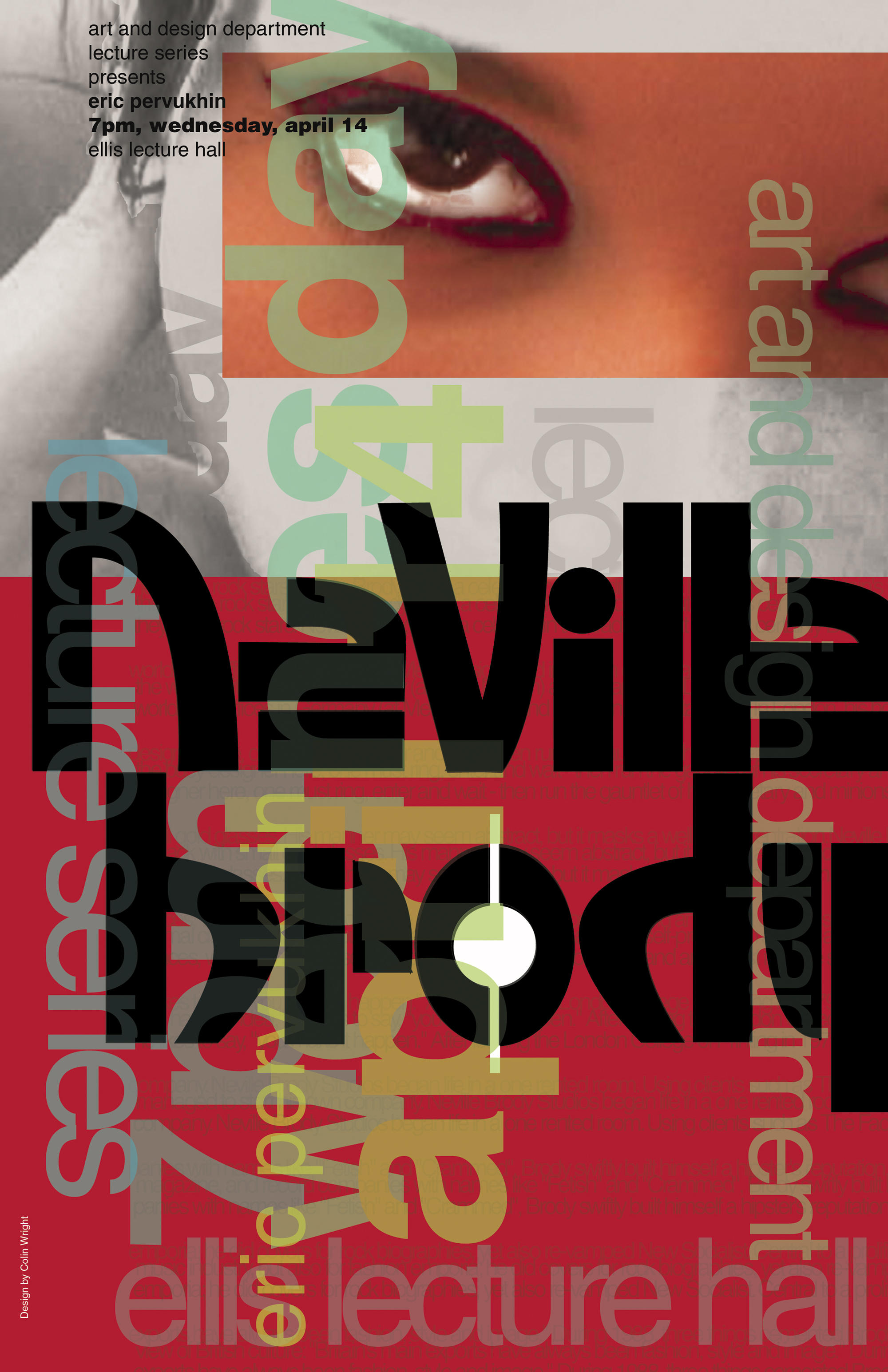
Neville Brody is perhaps the best known graphic designer of his generation. He studied graphic design at the London College of Printing and first made his way into the public eye through his record cover designs and his involvement and in the British independent music scene in early 1980s.
He was art director of the magazine The Face where he designed various typefaces. He was postmodetnist, challenged conventions in editorial design. He incorporated hand-drawn typefaces and custom graphic symbols into his page layouts. He inspired a magazine designers by designing a distinctive typographical appearance. Later on he worked for the Apple Mackintosh.
He rejected all commercialization of his graphic style, so his designs soon became much-imitated models for magazines, advertising and consumer-oriented graphics of the 80s. Later on he began designing his own typeface, open the way for the advent of digital type design. He embarked on a completely opposite way using minimalist, non-decorative typography. He was working for the British labels Stiff Records and Fetish Records.
In 1994, together with business partner Fwa Richards, launched Research studios, London. He was constantly pushed the boundaries of visual communication in all media through his experimental and challenging work, and continues to extend the visual languages we use through his exploratory creative expression. The best selling graphic design book was his first of two monographs, published in 1988.
References:
Neville Brody | Designer | FontShop. 2014. Neville Brody | Designer | FontShop. [ONLINE] Available at:http://www.fontshop.com/fonts/designer/neville_brody/. [Accessed 18 January 2014].
Neville Brody: Biography & Graphic Art. 2014. Neville Brody: Biography & Graphic Art. [ONLINE] Available at: http://schoolworkhelper.net/neville-brody-biography-graphic-art/. [Accessed 18 January 2014].
April Greiman
She is a designer in New York City in the mid-1970s when she decided to leave the comfort of a design community for an uncertain future on the opposite coast.
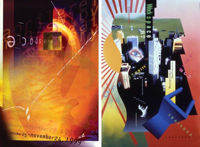
Ten years later, the Macintosh was making an entry into the design market. By the sound of it most of the designer were skeptical, it was innovative and a bit weird to make the computer into design practice. the future wherein the tactility of the hand was usurped by the mechanic a bits and bytes. But some of them including April Greiman saw the future and potential in this. She quickly established herself as a pioneer of digital communication tools and design.
She was really fascinating, and her curiosity and questioning with her desire to explore was really inspiring. In her work, she continued to explore typographic meaning and began experimenting with ways to alter the two-dimensional space of the page and re-imagine it as a more three- and four-dimensional continuum of time and space.
As she was regarded, she was one of the most influential designer of the digital age. She changed the magazine's format by creating an issue that unfolded into a 3'x 6' poster. That issue is called ''Does it make sense'' and it contained a life size, nude self-portrait, layered with symbols and typography. That's how she made the design word to think about the contributions computers could provide. She was experimenting with typography and image placement, in direct contrast to the rigid Swiss grids of the past. New Wave postmodernist challenged designers to experiment without laying beyond the grid.
Ten years later, the Macintosh was making an entry into the design market. By the sound of it most of the designer were skeptical, it was innovative and a bit weird to make the computer into design practice. the future wherein the tactility of the hand was usurped by the mechanic a bits and bytes. But some of them including April Greiman saw the future and potential in this. She quickly established herself as a pioneer of digital communication tools and design.
References:
Design discussions: April Greiman on technology: idsgn (a design blog). 2014. Design discussions: April Greiman on technology: idsgn (a design blog). [ONLINE] Available at: http://idsgn.org/posts/design-discussions-april-greiman-on-technology/. [Accessed 18 January 2014].
AIGA | April Greiman . 2014. AIGA | April Greiman . [ONLINE] Available at:http://www.aiga.org/medalist-aprilgreiman/. [Accessed 18 January 2014].
Wolfgang Weingart
Wolfgang Weingart is a German graphic designer credited as the progenitor of the New Wave typography. He said '' I took Swiss typography as my starting point, but then i blew it apart, never forcing any style upon my students. I never intended to create a style. It just happened when the students picked up- and misinterpreted- a so called Weingart style, and spread it around.'' He showed his mastery of typographic rules and the meaning achieved in breaking them. He is the mean of attitude rather than learning, curiosity and experience and of order experiment and visual enjoyment.
In his earlier work, he created abstract patterns with type and did unconventional almost absurd. But from all that it developed to tangible aesthetic and a deep appreciation of typography.
He believed that the tradition of Swiss typography played an important international role from the 50s until the end of the 60s, but than became sterile and anonymous. He also learned the skills of photo-lithography, developing new concepts, masking and overlaying films, and using camera to distort, enlarge or blur type.
He took the grid and the typeface Aksidenz-Grotesk from its restrictive Swiss design and applied it to designs. He created rectilinear stepped blocks, and made use of dot-screen texture and photography in his designs. He influenced the development of New Wave Deconstruction and much of graphic design in the 1990s.
In his earlier work, he created abstract patterns with type and did unconventional almost absurd. But from all that it developed to tangible aesthetic and a deep appreciation of typography.
References:
AIGA | Wolfgang Weingart . 2014. AIGA | Wolfgang Weingart . [ONLINE] Available at: http://www.aiga.org/medalist-wolfgang-weingart/. [Accessed 18 January 2014].
Wolfgang Weingart. 2014. Wolfgang Weingart. [ONLINE] Available at:http://www2.palomar.edu/users/gkelley/Weingart.html. [Accessed 18 January 2014].
Subscribe to:
Posts (Atom)


