Monday 10 March 2014

Futurism 1

Futurism began when the Italian poet Filippo Marinetti published his Manifesto of Futurism in the Paris newspaper Le Figaro 1909. He established futurism as a revolutionary movement. Artist in this movement were fighting against the reallity of scientific and industrial society.. Later in 1913 Marinetti published article against the classical tradition and in which he was calling for a typographic revolution.


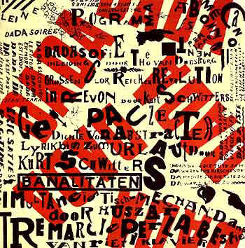
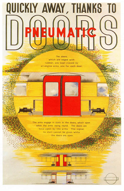
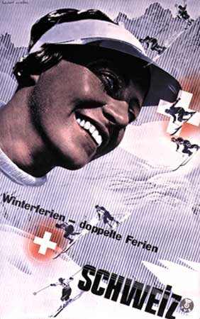
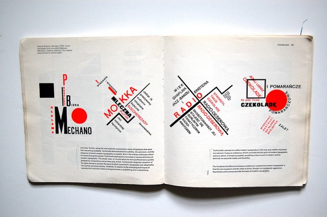
Most of the graphic designers of that time used vigorous horizontal and vertical structure. They did not want any more to be traditional so they put in their designs dynamic, non-linear composition achieved by pasting words and letters in place for reproduction from photo-graved printing plates. Lewis Carrol's Alice's Adventures used very innovative and different way of presenting text in the page. It was constructed mouse's tail from the letters.

One of the artist who wanted to live by the terms of futurist philosophy is Fortunato Depero (1892-1960). He produced a lot of thing such as dynamic posters, a lot of experimentinf with typography and advertising design. He worked for the magazines such as Vanity Fair, Movie Markers and Sparks. His techniques were adopted by Dadaists, constructivists and De Stijl.
References:
Inkling for Web. 2013. Inkling for Web. [ONLINE] Available at:https://www.inkling.com/read/history-of-graphic-design-philip-meggs-5th/chapter-13/futurism. [Accessed 24 November 2013].

Dada 1


Dada was the movement which came after WWI so because of that artists of that time were against all the rules and everything they had been passed through WWI. The others called it anti-art, so they meant for themselves to be, and had a strong negative and destructive element in they designs. They were rebellious, anarchistic.


It is reasonable for everything to be like that because the happenings in that period. They just wanted to do everything against that horrors of war. They also wanted to show the people why they were wrong for believing in machines. In one word they were rejecting all the tradition.


The artist of this movement were finding themselves mostly in the typography. They thought that through typography they can express them the best. The communication stood by everything aesthetic. They were using strong sharp letters to be understood, not just looking through them.


From graphic design aspect they were not extravagant so that they were making boom. They were using the most collage, photomontage and expressive typography. They were making socio-political effect in their posters by uncompromising criticism of that issues.  Some of the important designers were Hannah Hoch, John Heartfield, Raoul Hausmann, Kurt Schwitters, Georg Grosz, Max Ernst, etc...

References:
A History of Graphic Design: Chapter 45; Dadaism; The meeting point of all contradictions. 2013. A History of Graphic Design: Chapter 45; Dadaism; The meeting point of all contradictions. [ONLINE] Available at: http://guity-novin.blogspot.com/2011/08/chapter-44-dadaism-meeting-point-of-all.html. [Accessed 10 March 2014].

Cubism 1

Cubism was the movement ih history which had first abstract style in his designs.Design concept of cubism was independent from the nature, it began using tradition as a way of seeing and a pictorial art The people are calling it the revolutionary movement. It happen in the 20th century. Paul Cezanne is the one who started this movement.  He believed that you should treat nature in terms of the cylinder, the sphere and the cone. 

Fernand Leger , pages from 'La fin du monde'

The ideal of the cubist were to change the subject which they were gonna translate only for aesthetic but subject to look rather emotionally manipulated than translated naturally. Roots are considered to be found in the work of Pablo Picasso. 
This movement allowed artists and designers to show the figure in two dimensional way or in three dimensional way.

Fernand Leger, The city 1919

By this new approach and different things they tried at this movement, they changed and inspired a lot painters and graphic designers. It pushed art and design into geometric abstraction.


References:
Having a look at History of Graphic Design: Cubism. 2013. Having a look at History of Graphic Design: Cubism. [ONLINE] Available at:http://havingalookathistoryofgraphicdesign.blogspot.com/2012/11/cubism_7.html. [Accessed 10 March 2014].

Inkling. 2014. Inkling. [ONLINE] Available at:https://www.inkling.com/read/history-of-graphic-design-philip-meggs-5th/chapter-13/cubism. [Accessed 10 March 2014].

Modernism 1

Modernism is the movement of the 19th century through 20th century. It affected a lot of stadiums of life including: architecture, music, literature, art, etc. Because of mass use of the machines a the time, it was making the designers and every other human to re-think about their purposes. But through all that they still influences designers up till now. In spite of the using a lot of machinery instead of people, it had some of the positive things including mass production, which saved a lot of time for the people. The machinery became a thing related to the modernism.


Important designers from modernism movement are a lot, they can start from the impact of Walter Gropius from the Bauhaus to the modern architect Le Corbusier.
They well known rule was 'Function should always dictate form'.
Modernism is the movement which is considered for the most influential movement of the 20th century. It affected fine arts including impressionism, cubism, fauvism, brutalism and surrealism.


Because of the typography which was used before, they came up with the strict structured grid system with a lot of usage of the negative space and clean rigid type. They wanted to remove all the designs which were over decorated, and full filled with the imagery and type.


De Stijl

This movement was led by group of architect in which was Theo van Deosburg. Their style was to put blocks with black and whites, without any curves. Strict and simple.


They aim was to make established order in design by making and following certain rules. They are going by pure geometric forms and only using primary colors. This, although simple and basic had a lot of influences on graphic designer and the development of design itself.


References:
The easy guide to design movements: Modernism | Graphic design | Creative Bloq. 2013. The easy guide to design movements: Modernism | Graphic design | Creative Bloq. [ONLINE] Available at:http://www.creativebloq.com/graphic-design/easy-guide-design-movements-modernism-10134971. [Accessed 8 March 2014].

De Stijl : Design Is History. 2013. De Stijl : Design Is History. [ONLINE] Available at: http://www.designishistory.com/1920/de-stijl/. [Accessed 8 March 2014].

Jan Tschichold 1

Jan Tschichold was an typographic advisor and designer. He defined the new typography style.
His style was started to be recognisable at the time he did postwar refashioning of Penguin paperbacks in Britain. He was the only designer that used and came up with the horizontally banded covers. Some of them which he did were meant to be like that: orange for fiction, green for crime, blue for biography. That was his thing which made him famous and known.


At the young age he had contact with the world of print but he always wanted to now about the new movement in art. The influences of him were designs from Bauhaus, Russian Constructivism, Wassilly Kandinsky, Paul Klee, Moholy-Nagy etc. He created so called ,,The New Typography" which was published in 1928. He was trying to connect total complexity of the contemporary life with his typography.


His principles for the good designs are: the use of sans-serif fonts, standardised paper sizes, photographs rather than drawn illustrations, asymmetrical rather than centred layouts. Later own in his work it can be seen a bit of abstract work- geometrical elements, diagonal arrangements etc. He preferred half-tone photographs, hand drawn letters, always sans serif .His elegance in his designs, especially for book designs, his work with lettering and typefaces are what made him famous.


Bauhaus- The Face of the 20th century 1

Bauhaus is the thing which happend in the face and had a lot of influence on everybody than and still has. It was the school which was founded by Walter Gropius. In the Bauhaus they were teaching approaching to the design and combination of fine art and arts and crafts. At first the school was in Germany but later on by force from the Nazi political party, after it was moved to Dessau, it had to closed its door.
Two designers which had the main contribution to the school were Laszlo Moholy- Nagy and Harbert Bayer. They were teaching the new style of typography and development of sans-serif typography.


Lazlo Moholy- Nagy

The important person from Bauhaus which worked in all area of design. In his work you can see a bit of sense abstractionism. He worked as a stage designer, exhibition organiser, typographer and film producer.His playing with a lot of things such as painting, film, photography, design and with photograms made him important and famous.


References:
Bauhaus Influence | Abduzeedo Design Inspiration. 2013. Bauhaus Influence | Abduzeedo Design Inspiration. [ONLINE] Available at:http://abduzeedo.com/bauhaus-influence. [Accessed 9 March 2014].

The Bauhaus : Design Is History. 2013. The Bauhaus : Design Is History. [ONLINE] Available at: http://www.designishistory.com/1920/the-bauhaus. [Accessed 9 March 2014].

Lazlo Moholy-Nagy Biography - Infos - Art Market. 2013. Lazlo Moholy-Nagy Biography - Infos - Art Market. [ONLINE] Available at: http://www.moholy-nagy.eu/. [Accessed 9 March 2014].

International typography style 1

International or the Swiss grid Style came along after the rigid second world war which everybody can tell by looking at the designs. The designers which started this type of style were Josef Muller Brockmann, Armin Hofmann, Max Bill, Richard P Lohse, Hans Neuberg and Carlo Vivarelli.


Because of all the people been through the second world war their designs were cold, with emotionally sterile grid. Everything was strict with boundaries and rules; structured layout, unjustified type etc. The thing they were using the most in their designs was photograph instead of illustrations, and the strict typefaces industrial-looking. But all of that they created at this time was very inspirational for a lot of designers at the mid twentieth century.


Max Bill

One of the important graphic designers of the Swiss style. He was a really man at a lot of sides, he was doing industrial designs, doing stuff at architecture, sculptor, painter. His main call was advertising designs by which he is what he is today. He was studying architecture at the Bauhaus, and also metalwork, stage design and painting. Everything what represented the international typography was related to him and his work and he influenced people worldwide.


References
Max Bill (Swiss artist) -- Encyclopedia Britannica. 2013. Max Bill (Swiss artist) -- Encyclopedia Britannica. [ONLINE] Available at:http://www.britannica.com/EBchecked/topic/65351/Max-Bill. [Accessed 9 March 2014].

A History of Graphic Design: Chapter 42; The Swiss Grid System -- and the Dutch Total Grid. 2013. A History of Graphic Design: Chapter 42; The Swiss Grid System -- and the Dutch Total Grid. [ONLINE] Available at: http://guity-novin.blogspot.com/2011/07/chapter-42-swiss-grade-style-and-dutch.html. [Accessed 9 March 2014].

Commercial Modernism 1

Herbert Matter


 Herbert Matter was Swiss graphic designer and photographer. He is well known by his work with photomontage in photography and graphic design. He designed a lot of Swiss travel posters in which he uses his famous photomontage technique.


 With his contribution and innovative designs and style he became professor at the Yale university and had a lot of client including Museum of Modern Art, Guggenheim Museum, Knoll Furniture, Heaven Railroad etc. His unique techniques was very well known at the time and even today, especially his use of color, sizes, typography including overprinting which started from him.Matter was inspired by the work of El Lissitzky and Man Ray especially by photograpms, and the magic of collage and montage. All of that and him represents the pre-war European Modernism and the post-war expression of that movement in the United States.


References:
Herbert Matter: Modernist Photography and Graphic Design | Stanford University Libraries. 2013. Herbert Matter: Modernist Photography and Graphic Design | Stanford University Libraries. [ONLINE] Available at:https://library.stanford.edu/spc/exhibitspublications/past-exhibits/herbert-matter-modernist-photography-and-graphic-design. [Accessed 9 March 2014].

The Visual Language Of Herbert Matter | a documentary film by Reto Caduff . 2013. The Visual Language Of Herbert Matter | a documentary film by Reto Caduff . [ONLINE] Available at: http://www.herbertmatter.net/matter.html. [Accessed 9 March 2014].

Sunday 9 March 2014

The New York School (Paul Rand) 1

  More than anyone else Paul Rand brought the American style to the design and started the New York School. His career he started by working at the magazines as a editorial and promotional designer. By his work then, his covers at the magazines was something that changed and broke the boundaries and the graphic design industry.


 His inspirations were the work of Klee, Kandinsky, and some of the cubist.
He had the innovative approach to manipulate visual forms (shapes, colors, space, line, value). He known how to make analysis of communication content into something else but not making it boring.
He was playing with dynamic, contrast, and everything what was not seen so far.


He made one design which was very good fact that something is happening- global war. He made a Christmas package wrapped with barbed wire instead of ribbon.


His type of style was collage, photomontage, playing with images, textures and a lot of different objects.


References:
Inkling for Web. 2014. Inkling for Web. [ONLINE] Available at:https://www.inkling.com/read/history-of-graphic-design-philip-meggs-5th/chapter-19/pioneers-of-the-new-york-school. [Accessed 9 March 2014].

Pop Art 1

Pop Art was the movement of the 50s. It was born originally in the Britain. This movement was appreciating and supporting mass communication. They were responding to advertisement, and they wanted to wake up the energy of the young people born in the Post-World War. Everything was full with optimism and happiness. Colors was everything to them, using of flat imagery with the colors was the best combination. Their influences were found mainly in the comic books. Some of the roots can be found in the Dada movement, as an anti-art expression.

Seymor Chwast


One of the most important persons in this period, and the one without who the pop art movement would not be what it is today is Seymor Chwast. He is well known by his illustrations and graphic design which were so unique and innovative at the time. He was using different techniques of playing with type, layouts and an alternative of the Swiss formalism.


His style was very known by his approaches to the graphic art. His designs were using all over the world in the animated films, advertising, at the TV, record covers, children book's package designs, posters, and magazines. He really affected everything. He was working with a lot of famous clients and he was exposed by a really a lot people, magazines etc. His impact on the world is amazing.


References:

Pop Art - Art History Basics on Pop Art - mid-1950s to Early 1970s. 2014.Pop Art - Art History Basics on Pop Art - mid-1950s to Early 1970s. [ONLINE] Available at: http://arthistory.about.com/od/modernarthistory/a/Pop-Art-Art-History-101-Basics.htm. [Accessed 8 March 2014].

Seymour Chwast Biography. 2014. Seymour Chwast Biography. [ONLINE] Available at: http://rogallery.com/Chwast_Seymour/chwast-bio.htm. [Accessed 8 March 2014].